Work
Websites built for Australian trade businesses.
A selection of websites built for Australian trade and service businesses.
Every screenshot is a real build. Contact details are blurred.
Central Coast Clean & Fresh
Built for a residential and commercial cleaning business. The hero photo leads with a real job, a plain-English service list sits below, and the contact bar stays fixed on mobile so the quote path is one tap away.
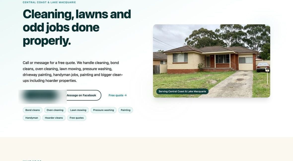
Desktop
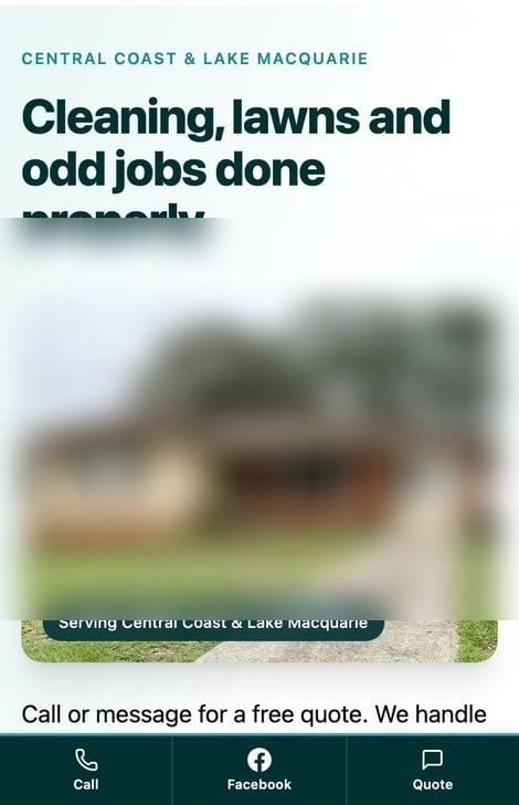
Mobile
Xuereb Earthworks
Built for an earthworks and excavation contractor. Excavation machinery across the hero, service areas stated plainly, and a request-a-quote button in the bottom bar on mobile.
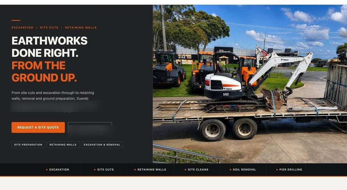
Desktop
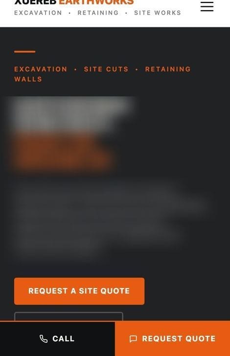
Mobile
More builds
Same idea, different trades.
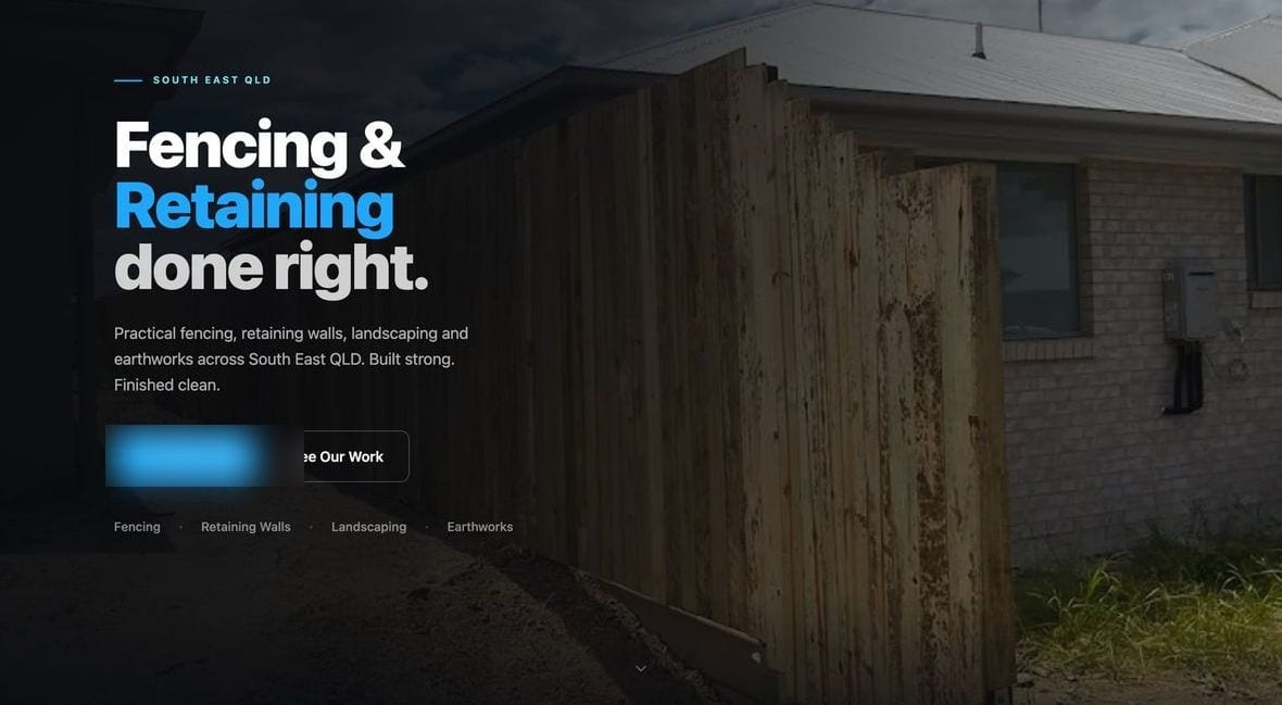
MJP Fencing & Retaining
Full-width hero over a real timber fence, with the quote path up top.
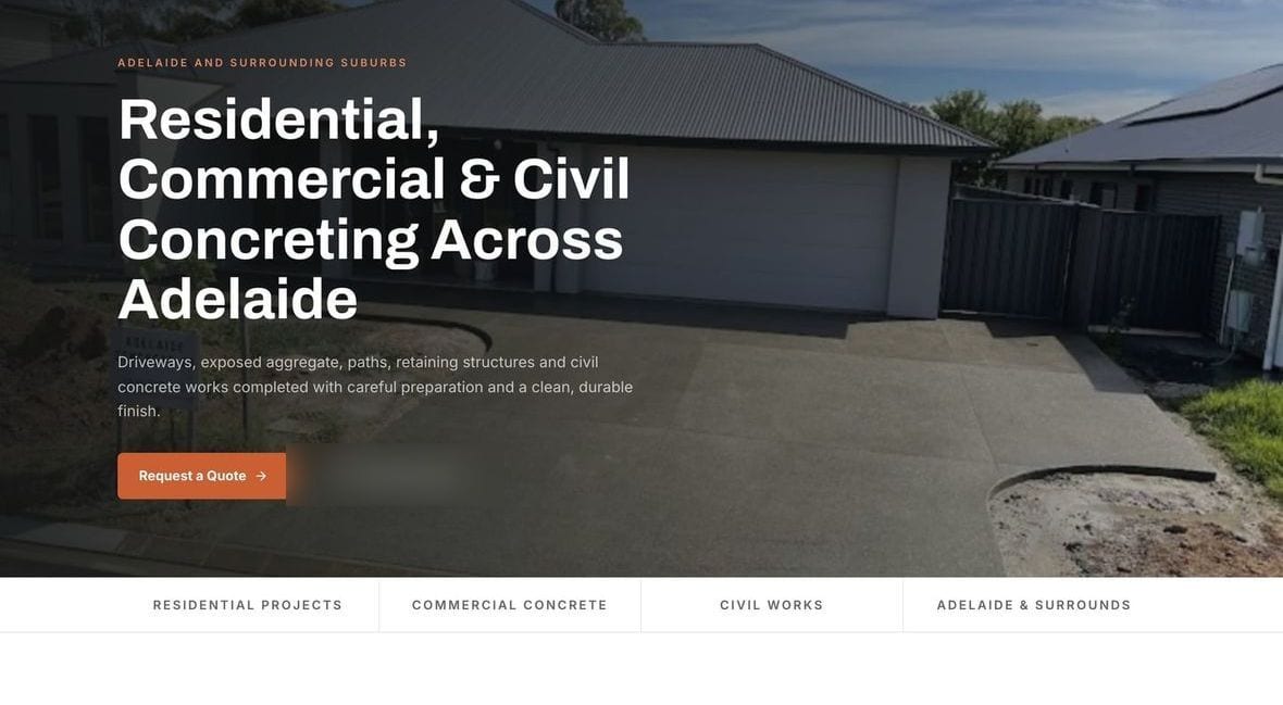
Adelaide Concrete & Civil
Jobsite hero and a captioned gallery of real pours.
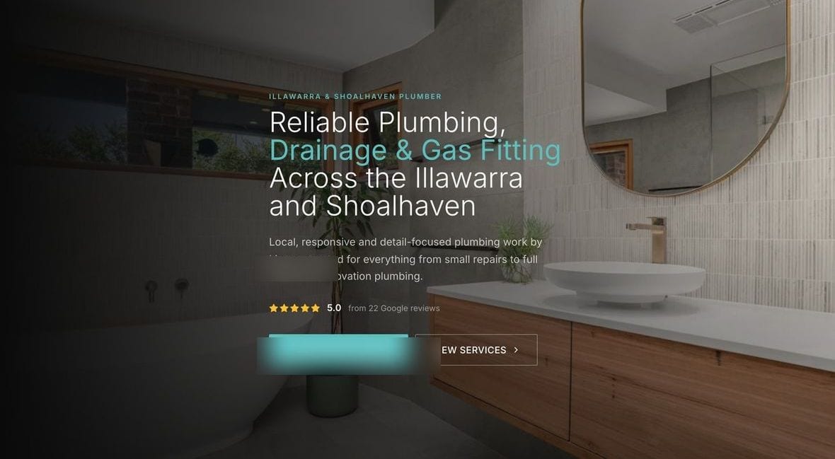
Holland Plumbing & Gas
Service areas clear, real job gallery, contact bar that follows you down the page.
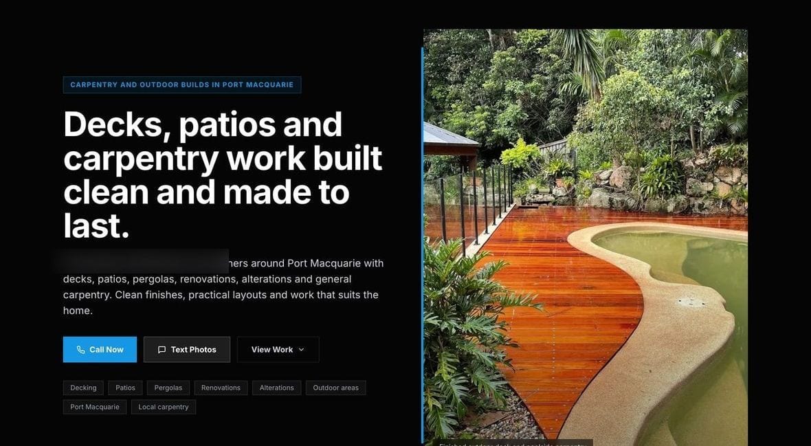
RG Carpentry
A knockout curved-deck hero and a full grid of real project photos.
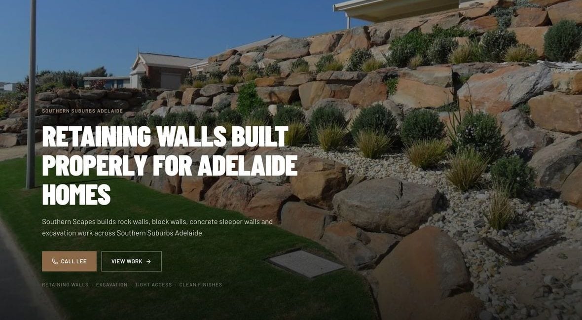
Southern Scapes Landscaping
A gallery of real hardscape and planting work with a phone-number call button in the header.
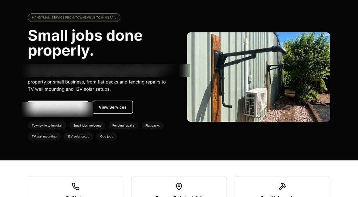
Aus Opal Man Handyman
A handyman services homepage with a service list and booking button.
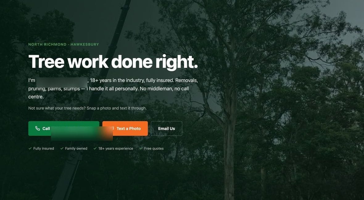
Austin’s Tree Contracting
Equipment photos and an enquiry form that is easy to find.
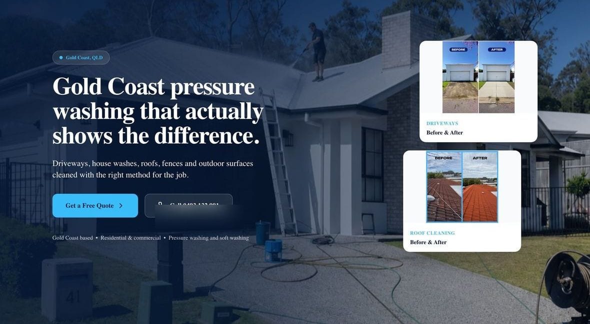
Bison Pressure Washing
Before-and-after photos across the hero, with a clear service list.
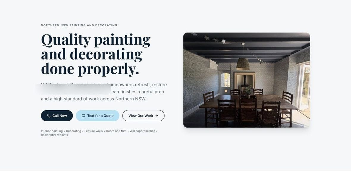
NS Painting & Decorating
Elegant and calm, with a genuine six-photo real-projects gallery.
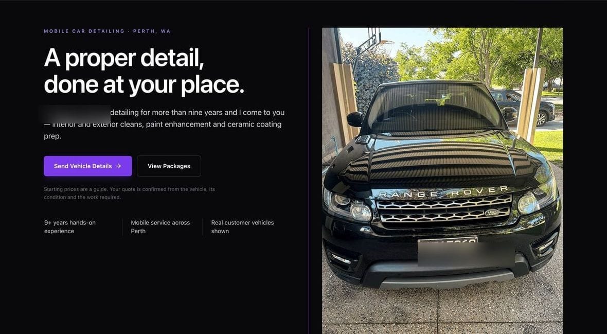
Walton’s Precision Auto Detailing
A premium dark hero with a real customer car and the owner’s honest no-stock-photos story.
These are website builds. The automation side — missed-call text-back, AI receptionist, follow-up sequences, review requests and the rest — is shown separately.
Nowra and Shoalhaven businesses — in-person availability across the region.
Want yours to look like these?
Send me your current site or Google listing and I'll build one page so you can see it.